What is Price Action?
Updated: 2017-10-09 11:23:27In the following two articles, we will cover the topic of understanding price action. As market participants, we cannot ignore the messages that price action leaves behind as it moves up and down on our charts. The key is knowing what to look for and where to look for it.
1. What is Price Action and Why is it Important?
Price action of currencies, stocks, bonds, or financial markets in general, is a reflection of human nature. Price movement is determined by market participants' decisions in response to a complex mix of psychological, sociological, political, economic and monetary factors. Price action trading is done by measuring the strength of these price movements while staying alert to potential changes.On the surface, the line between Technical Analysis (TA) and price action trading is blurred, as both methodologies look primarily at price itself and draw predictions from it. As Edwards & Magee put it in Technical Analysis of Stock Trends, Tenth Edition, “Technical Analysis is the science of recording, usually in graphic form, the actual history of trading […] and then deducing from that pictured history the probable future trend”.
Why is so much emphasis placed on price alone? At any given time, the price of a financial asset is determined by the forces of supply and demand as the flow of orders hit the marketplace. This supply, demand, and order flow all become imprinted in transactions data; as such, price action trading (and Technical Analysis) sees price as a final product which is the realized sum of all available factors.
In the words of Edwards & Magee echoing this perspective, “The market price reflects not only the differing value opinions of many orthodox security appraisers, but also the hopes and fears and guesses and moods, rational and irrational, of hundreds of potential buyers and sellers, as well as their needs and the resources – in total, factors which defy analysis and for which no statistics are obtainable, but which are nevertheless all synthesized, weighted and finally expressed into one precise figure at which the buyer and seller get together and make a deal.”
While understanding Technical Analysis and understanding price action both require an underlying respect for price itself, the similarities of TA and price action trading start to break down once you look into the deeper details. Much of Technical Analysis relies on an extremely wide array of indicators and various plotted lines (which, mind you, are nearly all derived from price anyway). Make no mistake: The markets don't respect straight lines, wavy lines, oscillators or the Lunar Phase. They trot on relentlessly.
Unlike the indicators used in TA, price action indicators are typically nothing more than the behavior of price in relation to major levels or past price movements. Unlike the convoluted application of patterns in many forms of TA, price action patterns don’t suffer from those ambiguity issues. We’ll delve into the specifics a bit later, but understand that price action trading cuts away the superfluous additions to a chart and leaves you alone with price to do your work.
2. What Advantages are Offered by Price Action Trading?
Your time is precious. Not everyone can afford to spend hours each and every day studying the deeper economics of a company or country, let alone doing so in a way that produces actionable trade ideas.
One of the beauties of price action trading is that it’s generally a less time-consuming method of asset selection than fundamental analysis and is based more on the actual performance of an asset than on its prospects for performance. This benefits traders because they can either spend the same time while broadening their pool of potential investment vehicles or simply spend less time analyzing the assets they already focus on. They can participate in a trend as it is unfolding because the methodology is timelier and for the same reason they are more likely to close out a trade that will go against them.
In a similar vein, understanding price action is a more palatable pursuit than trying to digest the seemingly infinite amount of information required to understand fundamental analysis. Those without a thorough background in economics or finance will have an extremely difficult time navigating the maze of underlying fundamentals, data releases, and balance sheets.
Additionally, an individual interested in making minute-to-minute decisions through daytrading will find that a fundamental approach becomes nearly irrelevant for this style of trading. Price action scalping provides that type of individual with a method to quickly enter and exit the market intraday. Price action trading is very well suited for the time-constrained, active trader whose interest is in trading itself without having to get caught up in the economical complexities behind the asset being traded.
3. Tools of the Trade
As students of price action, we can also adopt the term “chartists”. The chartist has chosen to study the visual representation of actual exchanges made, which is reflected in the current market price of the asset traded. The chartist is avoiding as many abstractions as possible. He knows that the chart is not everything, and that it does not offer an infallible guide to predicting the future.
But he also knows that what he's watching is simple enough to be more easily understood than the complex transactions behind it. It's like watching the shadow of a person: you can't make out exactly what the person looks like but you do have a good enough idea. Also, the chart works – if you can read it. It's not perfect but there is no perfection in the financial markets. The chartist remains flexible as he can make up the rules that define how he reads his “map” and can adapt those rules as soon as it’s required to do so. Also, the chartist can compare multiple assets using the same “map of reality”.
![clip_image002[3] clip_image002[3]](/Assets/SunBlogNuke/5/WindowsLiveWriter/PRICEACTIONDEFINEDpart1_81B1/clip_image0023_thumb.png)
A typical price action trading chart: vertical lines & horizontal lines are usually all you see
Don’t forget why we’re looking at this in the first place. Remember that you're not looking at hard data when you're looking at charts. You're looking at pure psychology expressed visually. You're looking at the aggregate decisions of all the market participants that are interested in trading at any one time.
Nowadays, most traders keep bar charts or Japanese Candlestick charts on their screens. There are advantages by viewing the market through Bars or Candles. Let’s take a quick look at a basic line chart and see why the alternatives are preferred.
![clip_image004[3] clip_image004[3]](/Assets/SunBlogNuke/5/WindowsLiveWriter/PRICEACTIONDEFINEDpart1_81B1/clip_image0043_thumb.png)
A line chart: this is a chart that connects only the closing price of each time segment. For example,
if we’re using a daily chart then we’re connecting the closing value of each day.
The chart above also connects the high and low value of each day.
A normal Line chart will show you the basic information about the market you're trading. It will show you the main turning points and the general direction. But what Line charts don't show you is what price has done DURING that particular time period. For our purposes, we can say that it is not the most efficient way of visually representing market psychology.
Compare that with a bar chart:
![clip_image006[3] clip_image006[3]](/Assets/SunBlogNuke/5/WindowsLiveWriter/PRICEACTIONDEFINEDpart1_81B1/clip_image0063_thumb.png)
A bar chart: each time period is represented as a bar showing the open, high, low, and close of that particular time segment.
Each vertical bar represents one period of price activity from the chosen periodicity. The top of the bar represents the market's high price and the bottom represents the market's low price. The left hash mark on the vertical bar indicates the opening price and the right hash mark on the bar represents the closing price. By including open, high, low and close information, bar charts allow for more detailed analysis than standard line charts but still take up the same amount of space.
And we can also bring up a Japanese Candlestick chart as well, which shows essentially the same information as a bar chart:
![clip_image008[3] clip_image008[3]](/Assets/SunBlogNuke/5/WindowsLiveWriter/PRICEACTIONDEFINEDpart1_81B1/clip_image0083_thumb.png)
A Candlestick Chart: again, each time period is represented as a candle showing the open, high, low, and close of that particular time segment.
Each candlestick represents one period of price activity from the chosen periodicity. Candles will either be hollow or filled. A hollow candlestick represents a higher close than its open and is usually shown without color or with some positive connotation (since these candles represent a net move higher in price). A filled-in candle represents a lower close than open and is usually colored with negative connotation (since these candles represent a net move lower in price).
Each candlestick drawn consists of two components: the candle body and the shadow. The real body is the thick part of the candlestick that represents the open and the close. The thin lines above and below the real body are the shadows (also called wicks). These shadows represent the session's price extremes (high and low).
While the bar chart and the candlestick chart both show the same things, the candlestick chart is viewed as a clearer version of the two which makes it easier to recognize price action patterns.
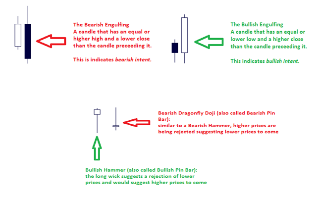
But remember that the markets are continuously grinding forward, and it's only our personal conventions that “divide” the markets into 1Hour, 2Hour, 3Hour, 4Hour...5Min...1Min...1Day candles or whatever time frame you may want to view (you could even have 237 minute candles!). The point being: if you only focus on 1 single candle, you're trading close-sighted specific candles and not price action patterns. Look at what happens when you “add” the action of multiple candles together:

3 bullish candles (or bearish candles) on 1 time frame, can be interpreted or seen as one large bullish
(or bearish) candles on another time frame. In this case, some would call the 3 candles “three white
soldiers” going up, or “three black crows” going down. The name doesn't matter: what matters is the
fact that candle formations are dependent on the time frame we observe them on.
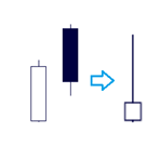
Above: the “dark cloud cover” can be seen as a pin-bar or “shooting star”.
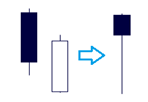
Above: the “piercing patter” can be seen as a pin-bar or a hammer.
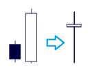
Above: a bullish engulfing can be seen as a pin-bar or a hammer.
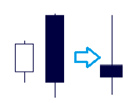
Above: a bearish engulfing can be seen as a pin-bar or a “shooting star”.
4. Price Action Patterns + Location = High Probability Opportunities
So now that we have seen the main price action indicators in the form of candlestick “signals”, can we jump into the market and take every signal we see? Clearly not.
Bear in mind that there is no direct cause and effect between a price action setup and future price developments; these price action patterns are simply summaries of the previous aggregate market psychology.
Just as important as actually correctly interpreting the signals, we must filter them depending on where they are setting up on the price chart. So where is it logical to look for certain price action patterns? Support or resistance levels, swing highs and swing lows, and stop loss clusters.
A) At Levels of Support & Resistance
Support and resistance are two very important concepts and you can build your entire trading career around these two concepts. Broadly speaking, a support is a level where the market previously showed demand; it's a level that propelled price higher. Instead, a resistance is a level that has previously shown supply; it's a level that has propelled price lower. Professional traders day in & day out highlight supply & demand zones and then wait for certain characteristics in order to initiate a trade.
There are always a great number of supply and demand zones on the charts, simply because the perception of value is constantly changing.
Market participants are constantly trying to price in (or discount) what will happen tomorrow, next week, next month, next year (which are all uncertain) and thus create an expectancy. Thus something that is highly in demand today may be sold aggressively tomorrow or next week. Of course, as many other things with the markets, we should always look at the most evident supply and demand levels (i.e., support and resistance levels). The more obvious the level, the larger the imbalance was created, a higher likelihood that more market participants will have seen and pay attention to this level, and thus the more likely price will see significant activity at that level.
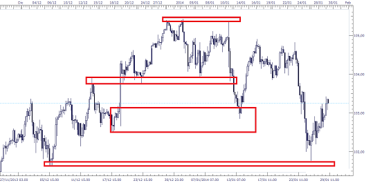
Take note that support and resistance are not always precise prices. They are more often zones or ranges, but nonetheless are clearly identifiable on a chart.
Now, due to the fractal nature of the markets, these support and resistance zones are created on all time frames. It's up to the trader's own objectives and risk-tolerance to decide whether to use them on all time frames or whether to stick to a handful of chosen time frames. Obviously the higher the time frame, the more participants are active and see it. Therefore, the more weight that particular zone/level may have.
Support and resistance are the only “Holy Grail” we believe in. The fact is that price levels that have been rejected before are evident on the chart because they usually show some sort of orderflow imbalance footprint: inside/outside candles, doji's, spinning bottoms or tops, etc. and price gets pushed aggressively away. When the market comes back to challenge that area, chances are that it will be a crossroads once again, where buyers and sellers will be fighting to establish the upper hand. Who will win? We will never know ahead of time. Trend and sentiment can give us a hand but the fact is this: You will never know ahead of time if a previously relevant support/resistance zone will hold and act the same as it did in the past.
The price drivers (sentiment) at one point in time are never the same as they are in other points of time, so what was once an important level may now be completely ignored. Or it will be equally important. The fact is that on a price chart we, as chartists, can observe these important zones where buyers and sellers fought it out once before, and may very well fight it out again.
So instead of trying to trade in the middle of nowhere, why not try to plan your trades around something so evident and so simple to use, like a support or resistance area?
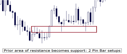
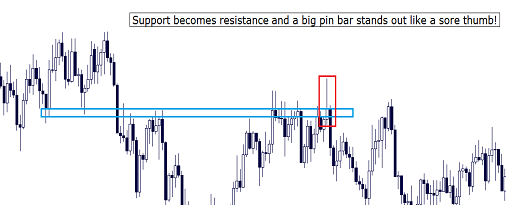
One final thing to note here that you may notice over time is the phenomenon of former support levels turning into a resistance level or vice-versa. This, like any other regularly observable price event, is attributed to the psychology of market participants and their subsequent actions.
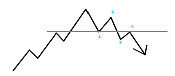
In the chart above, let's assume traders buy at point 1. The market has a good advance, going to point 2 and the traders are feeling good. Then the market takes a bad turn and drops below their entry point, going towards point 3. Now the traders are concerned about holding onto a losing proposition but still don't want to book a loss. They hold, hoping that the market will turn around and reach their entry point, so they can close out and break even on the trade (point 4). So at point 4, the marketplace is flooded with sell orders from buyers who are closing their position.
Looking back, at point 1 we had support and then at point 4, which was the same price, we now have resistance. The opposite would be true for a resistance-becomes-support.
B) At Prior Swing High and Swing Low Levels
Swing levels are even clearer to spot on charts than support and resistance. All you have to do is spot where prices have made an evident “U-Turn” and started to trek the other way. While the reasons behind this behavior may be more complex than we could ever imagine, practically speaking we can say that demand has overwhelmed supply (which made price “swing low” and then come back up), or supply has overwhelmed demand (which made price “swing high” and then come back down).
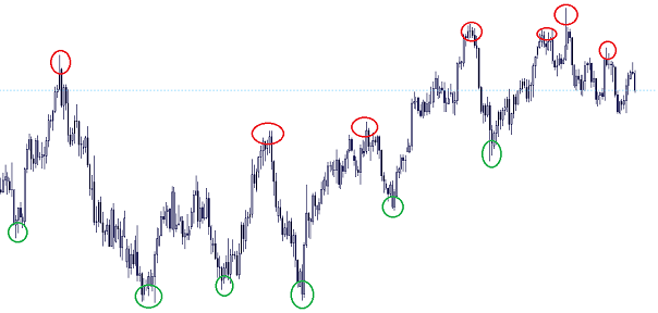
Swing highs (red) and swing lows (green): evident areas of order flow imbalance
So these areas are also great areas to look for the usual candle formations:
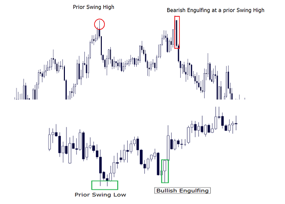
C) Stop-Loss Orders
We always try to highlight the importance of a stop-loss (also casually referred to as just a ‘stop’), both in two ways: being sure to use them in your personal trading system to control risk; understanding the effects of large clusters of stop-loss orders from other market participants. Here, we’ll touch on the subject, but the role of stops is explained in-depth in our Orderflow Mindset Lessons.
As mentioned earlier, notable support, resistance, and swing levels usually draw in attention and consequently see increased activity around them. Because these areas tend to promote more trading volumes, they have a tendency to reinforce themselves. This is why areas of support and resistance usually repeat or stay in force. As such, these areas are seen as good ‘protection’ for an open trade. That is, someone holding a long position will view support as their friend since it is a likely point where price won’t be able to push any lower (the opposite is true for those holding short positions seeing resistance as their friend).
The next logical step, then, is to tuck your stop-loss order just beyond these levels (below support for longs, above resistance for shorts). When these stops cluster in this manner, if the level is broken and those stop orders are triggered, the increased trading activity at that level provides another layer to our price action indicators
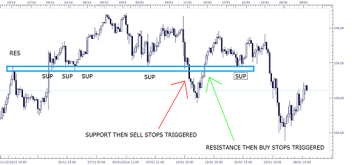
To sum all of this up: markets are populated by people that make decisions based on a huge variety of different plans. Price action allows us to focus on which plans are actually playing out because it directly translates the psychology of market participants into a language that we can use to our benefit. But it's important to evaluate market behavior (in the form of price action patterns) at evident points that the market itself has proven to be significant (swing points and support/resistance areas, both places where stop loss orders tend to cluster) – ensuring that you risk your hard-earned capital where it counts.
Stay tuned for part 2 next week where we’ll dive even deeper into understanding price action, incorporating a few of the useful technical analysis indicators when appropriate, and how we can use all of this information to make effective trades.
